library(tidyverse)
results_2016 <- read_csv("https://datavizf23.classes.andrewheiss.com/files/data/external_data/results_2016.csv")Weeks 8, 9, and 10 tips and FAQs
FAQs
Hi everyone!
Apologies for the delay on FAQ posts! I’ve got some extra good tips here, though, to make up for the past couple weeks!
In my coefficient plot, the coefficient for per_capita_income didn’t have error bars around it. Why?
(Technically this was from week 7, but I got a lot of questions about it after I posted the FAQs for week 7, so here it is.)
In exercise 7 you created a coefficient plot for a regression model predicting Democratic vote share in the 2016 presidential election based on a bunch of county-level characteristics:
library(broom)

model <- lm(percent_dem ~ median_age + percent_white +
              per_capita_income + median_rent + state,
            data = results_2016)

results <- tidy(model, conf.int = TRUE) %>%
  filter(!str_detect(term, "state"))

results
## # A tibble: 5 × 7
##   term               estimate std.error statistic   p.value  conf.low conf.high
##   <chr>                 <dbl>     <dbl>     <dbl>     <dbl>     <dbl>     <dbl>
## 1 (Intercept)       58.5      1.66          35.3  5.73e-229 55.2      61.8
## 2 median_age         0.166    0.0368         4.52 6.33e-  6  0.0942    0.238
## 3 percent_white     -0.682    0.0110       -61.9  0         -0.704    -0.661
## 4 per_capita_income  0.000271 0.0000497      5.46 5.18e-  8  0.000174  0.000369
## 5 median_rent        0.0200   0.00163       12.3  6.23e- 34  0.0168    0.0232
The point ranges in the plot show the coefficient and the confidence interval around the coefficient. Median rent and per capita income here are just dots, though. Did something go wrong? Why is there no confidence interval?
ggplot(filter(results, term != "(Intercept)"),
       aes(x = estimate, y = term)) +
  geom_pointrange(aes(xmin = conf.low, xmax = conf.high))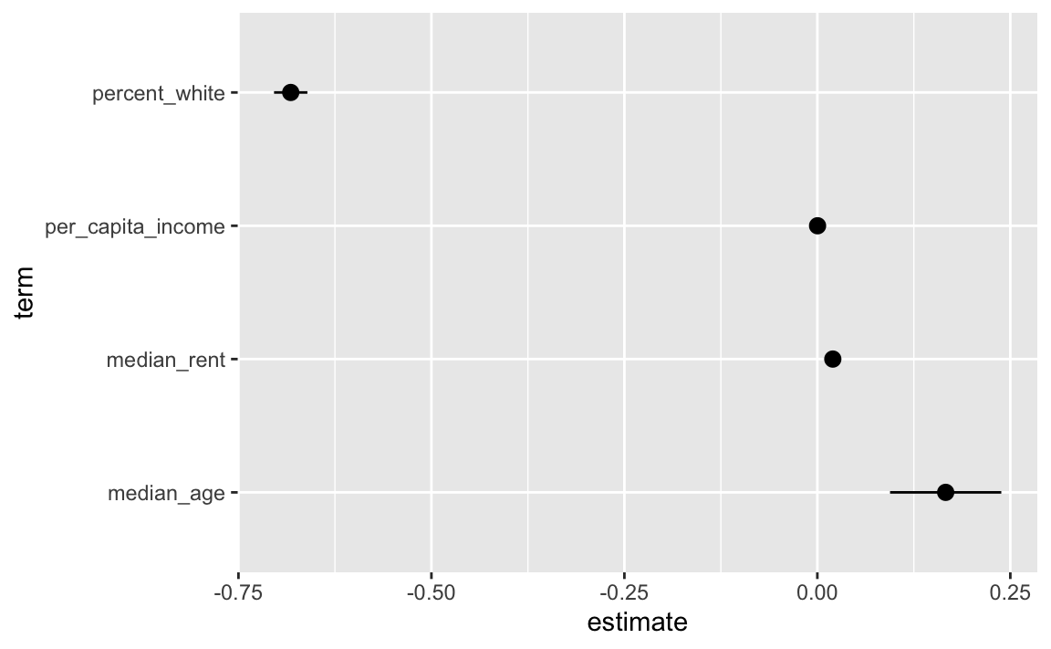
There is a confidence interval, it’s just really tiny! That’s because of how these variables are measured in the data. Each county has a dollar amount recorded for rent and income:
results_2016 %>%
  select(state, county, per_capita_income, median_rent)
## # A tibble: 3,158 × 4
##    state   county   per_capita_income median_rent
##    <chr>   <chr>                <dbl>       <dbl>
##  1 Alabama Autauga              24571         668
##  2 Alabama Baldwin              26766         693
##  3 Alabama Barbour              16829         382
##  4 Alabama Bibb                 17427         351
##  5 Alabama Blount               20730         403
##  6 Alabama Bullock              18628         276
##  7 Alabama Butler               17403         331
##  8 Alabama Calhoun              20828         422
##  9 Alabama Chambers             19291         374
## 10 Alabama Cherokee             22030         375
## # ℹ 3,148 more rows
When looking at the regression coefficient, we interpret then using single dollars. We’d say something like “A $1 increase in per capita income is associated with a 0.00027 percentage point increase in Democratic vote share, on average.”
Talking about $1 changes, though, is weird because that kind of change in income really isn’t detectable. That’d be like looking at what happens to voting patterns if income in a county goes from $30,000 to $30,001 or $65,000 to $65,001. Nothing’s going to happen to voting patterns! If the original democratic vote share was 60%, a $1 increase in income would increase that by 0.00027 percentage points to 60.00027%.
To make that coefficient more interpretable we can scale down the income column and think of it as hundreds or thousands of dollars instead. We can do that by making a new column in the data…
results_2016 <- results_2016 %>%
  mutate(per_capita_income_1000 = per_capita_income / 1000)

results_2016 %>%
  select(state, county, per_capita_income_1000, per_capita_income)
## # A tibble: 3,158 × 4
##    state   county   per_capita_income_1000 per_capita_income
##    <chr>   <chr>                     <dbl>             <dbl>
##  1 Alabama Autauga                    24.6             24571
##  2 Alabama Baldwin                    26.8             26766
##  3 Alabama Barbour                    16.8             16829
##  4 Alabama Bibb                       17.4             17427
##  5 Alabama Blount                     20.7             20730
##  6 Alabama Bullock                    18.6             18628
##  7 Alabama Butler                     17.4             17403
##  8 Alabama Calhoun                    20.8             20828
##  9 Alabama Chambers                   19.3             19291
## 10 Alabama Cherokee                   22.0             22030
## # ℹ 3,148 more rows
…and then using that new per_capita_income_1000 in the model instead:
model <- lm(percent_dem ~ median_age + percent_white +
              per_capita_income_1000 + median_rent + state,
            data = results_2016)

results <- tidy(model, conf.int = TRUE) %>%
  filter(!str_detect(term, "state"))

results
## # A tibble: 5 × 7
##   term                 estimate std.error statistic   p.value conf.low conf.high
##   <chr>                   <dbl>     <dbl>     <dbl>     <dbl>    <dbl>     <dbl>
## 1 (Intercept)           58.5      1.66        35.3  5.73e-229  55.2      61.8
## 2 median_age             0.166    0.0368       4.52 6.33e-  6   0.0942    0.238
## 3 percent_white         -0.682    0.0110     -61.9  0          -0.704    -0.661
## 4 per_capita_income_1…   0.271    0.0497       5.46 5.18e-  8   0.174     0.369
## 5 median_rent            0.0200   0.00163     12.3  6.23e- 34   0.0168    0.0232
Now the coefficient is bigger and we have a more visible confidence interval:
ggplot(filter(results, term != "(Intercept)"),
       aes(x = estimate, y = term)) +
  geom_pointrange(aes(xmin = conf.low, xmax = conf.high))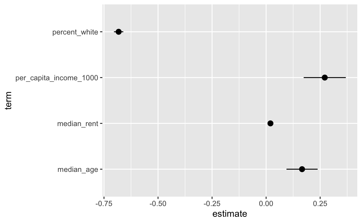
Now we can say something like “A $1,000 increase in per capita income is associated with a 0.27 percentage point increase in Democratic vote share, on average” (or going from something like 60% to 60.27%)
The importance of layer order
So far this semester, most of your plots have involved one or two geom_* layers. At one point in some video (I think), I mentioned that layer order doesn’t matter with ggplot. These two chunks of code create identical plots:
ggplot(...) +
  geom_point(...) +
  theme_minimal(...) +
  scale_fill_viridis_c(...) +
  facet_wrap(...) +
  labs(...)

ggplot(...) +
  geom_point(...) +
  labs(...) +
  theme_minimal(...) +
  facet_wrap(...) +
  scale_fill_viridis_c(...)
All those functions can happen in whatever order you want, with one exception. The order of the geom layers matters. The first geom layer you specify will be plotted first, the second will go on top of it, and so on.
Let’s say you want to have a violin plot with jittered points on top. If you put geom_point() first, the points will be hidden by the violins:
library(palmerpenguins)
penguins <- penguins %>% drop_na(sex)

ggplot(penguins, aes(x = species, y = body_mass_g)) +
  geom_point(position = position_jitter(seed = 1234), size = 0.5) +
  geom_violin(aes(fill = species))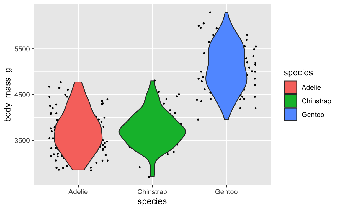
To fix it, make sure geom_violin() comes first:
ggplot(penguins, aes(x = species, y = body_mass_g)) +
  geom_violin(aes(fill = species)) +
  geom_point(position = position_jitter(seed = 1234), size = 0.5)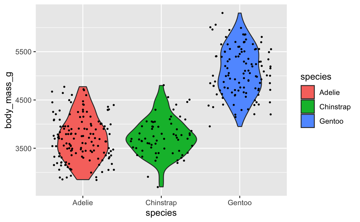
You saw this back in exercise 7 too when you plotted the predicted values of your regression model with geom_line() and a confidence interval with geom_ribbon(). If you put the line first, then the ribbon, the ribbon covers up the line—here that line should be bright red, but the grey of the ribbon makes it darker:
library(marginaleffects)

my_predictions <- predictions(
  model,
  newdata = datagrid(median_age = seq(21, 60, by = 1),
                     state = "Georgia"))

ggplot(my_predictions, aes(x = median_age, y = estimate)) +
  geom_line(linewidth = 1, color = "red") +
  geom_ribbon(aes(ymin = conf.low, ymax = conf.high), alpha = 0.5)
If you put the ribbon first and then the line, the line is the correct shade of red:
ggplot(my_predictions, aes(x = median_age, y = estimate)) +
  geom_ribbon(aes(ymin = conf.low, ymax = conf.high), alpha = 0.5) +
  geom_line(linewidth = 1, color = "red")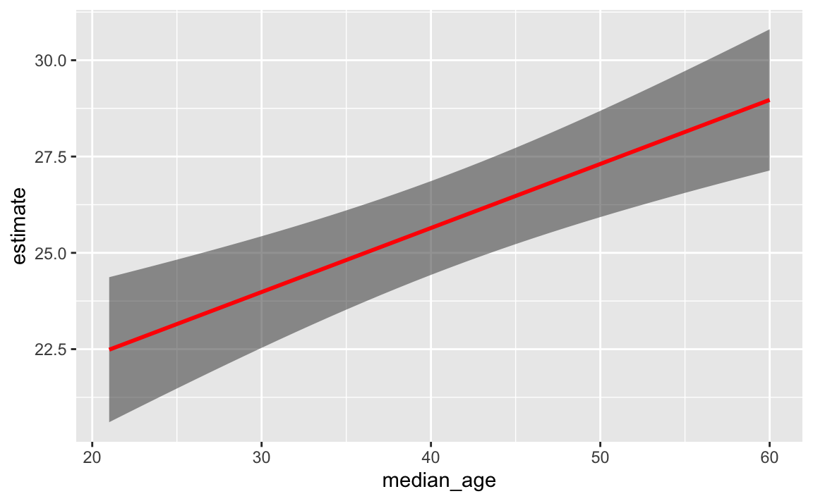
This layer order applies to annotation layers too. If you want to highlight an area of the plot (or highlight a recession, like in session 11), adding a rectangle after the geom layers will cover things up, like this ugly yellow rectangle here:
ggplot(penguins, aes(x = bill_length_mm, y = body_mass_g, color = species)) +
  geom_point() +
  annotate(geom = "rect", xmin = 40, xmax = 60, ymin = 5000, ymax = 6100,
           fill = "yellow", alpha = 0.75)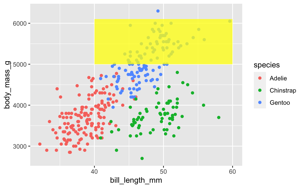
To fix that, put that annotate() layer first, then add other geoms on top:
ggplot(penguins, aes(x = bill_length_mm, y = body_mass_g, color = species)) +
  annotate(geom = "rect", xmin = 40, xmax = 60, ymin = 5000, ymax = 6100,
           fill = "yellow", alpha = 0.75) +
  geom_point()
This doesn’t mean all annotate() layers should come first—if you want an extra label on top of a geom, make sure it comes after:
ggplot(penguins, aes(x = bill_length_mm, y = body_mass_g, color = species)) +
  # Yellow rectangle behind everything
  annotate(geom = "rect", xmin = 40, xmax = 60, ymin = 5000, ymax = 6100,
           fill = "yellow", alpha = 0.75) +
  # Points
  geom_point() +
  # Label on top of the points and the rectangle
  annotate(geom = "label", x = 50, y = 5500, label = "chonky birds")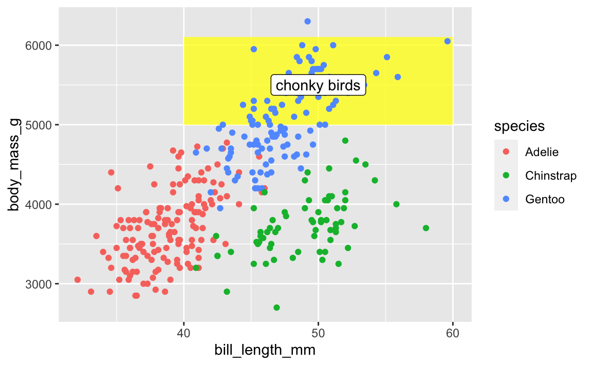
My personal preferred general layer order
When I make my plots, I try to keep my layers in logical groups. I’ll do my geoms and annotations first, then scale adjustments, then guide adjustments, then labels, then facets (if any), and end with theme adjustments, like this:
library(scales)

ggplot(penguins, aes(x = bill_length_mm, y = body_mass_g, color = species)) +
  # Annotations and geoms
  annotate(geom = "rect", xmin = 40, xmax = 60, ymin = 5000, ymax = 6100,
           fill = "yellow", alpha = 0.75) +
  geom_point() +
  annotate(geom = "label", x = 50, y = 5500, label = "chonky birds") +
  # Scale adjustments
  scale_x_continuous(labels = label_comma(scale_cut = cut_si("mm"))) +
  scale_y_continuous(labels = label_comma(scale_cut = cut_si("g"))) +
  scale_color_viridis_d(option = "plasma", end = 0.6) +
  # Guide adjustments
  guides(color = guide_legend(title.position = "left")) +
  # Labels
  labs(x = "Bill length", y = "Body mass", color = "Species:",
       title = "Some title", subtitle = "Penguins!", caption = "Blah") +
  # Facets
  facet_wrap(vars(sex)) +
  # Theme stuff
  theme_minimal() +
  theme(plot.title = element_text(face = "bold", size = rel(1.4)),
        plot.caption = element_text(color = "grey50", hjust = 0),
        axis.title.x = element_text(hjust = 0),
        axis.title.y = element_text(hjust = 1),
        strip.text = element_text(hjust = 0, face = "bold"),
        legend.position = "bottom",
        legend.justification = c(-0.04, 0),
        legend.title = element_text(size = rel(0.9)))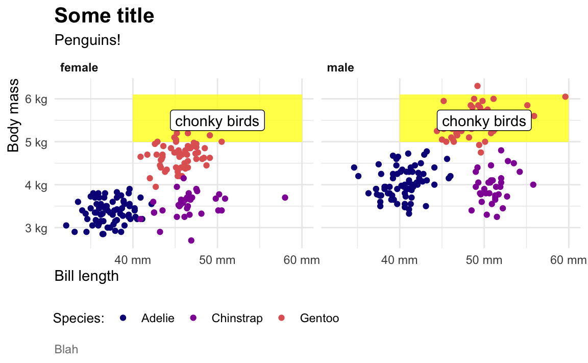
This is totally arbitrary though! All that really matters is that the geoms and annotations are in the right order and that any theme adjustments you make with theme() come after a more general theme like theme_grey() or theme_minimal(), etc.. I’d recommend you figure out your own preferred style and try to stay consistent—it’ll make your life easier and more predictable.
My plot didn’t translate perfectly to ggplotly—why?
In session 10 you used ggplotly() to convert a ggplot object into an interactive plot, which I think is magical:
library(plotly)

basic_plot <- ggplot(penguins, aes(x = bill_length_mm, y = body_mass_g, color = species)) +
  geom_point()

ggplotly(basic_plot)
However, lots of you discovered that Plotly does not translate everything perfectly. Plotly is a separate Javascript library and it doesn’t support every option ggplot does. ggplotly() tries its best to translate between R and Javascript, but it can’t get everything. For instance, subtitles, captions, and labels disappear:
fancy_plot <- ggplot(penguins, aes(x = bill_length_mm, y = body_mass_g, color = species)) +
  geom_point() +
  annotate(geom = "label", x = 50, y = 5500, label = "chonky birds") +
  labs(title = "Penguin bill length and weight",
       subtitle = "Neato",
       caption = "Here's a caption")

ggplotly(fancy_plot)
That’s just a limitation with ggplot and plotly. If you want a perfect translation, you’ll need to hack into the guts of the translated Javascript and HTML and edit it manually to add those things.
Alternatively, you can check out other interactive plot packages. {ggiraph} makes really great and customizable interactive plots (and it supports things like subtitles and captions and labels and other annotations ggplotly can’t), but with slightly different syntax:
library(ggiraph)

plot_thing <- ggplot(data = penguins) +
  geom_point_interactive(aes(x = bill_length_mm, y = body_mass_g, color = species,
                             tooltip = species, data_id = species)) +
  annotate(geom = "label", x = 50, y = 5500, label = "chonky birds") +
  labs(title = "Penguin bill length and weight",
       subtitle = "Neato",
       caption = "Here's a caption")

girafe(ggobj = plot_thing)